
Making Process
In Moto Kai's own words
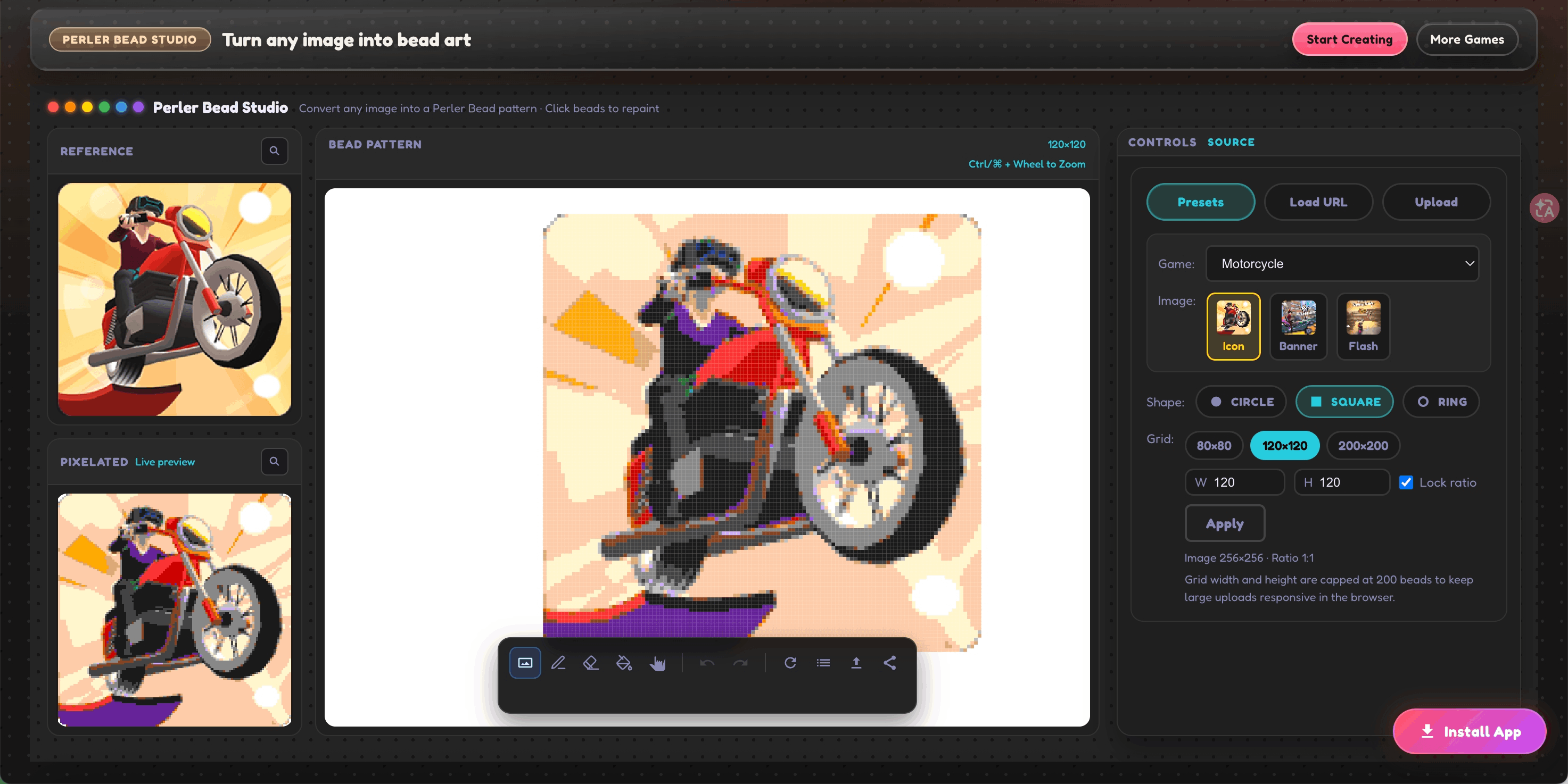
I wanted to test the preset library before committing to a custom photo, so I picked the motorcycle image from the Studio’s built-in options. Didn’t expect to end up making the actual piece from it, but the preview looked too good to pass on.
120×120 is a significant step up from anything I’d done before. 14400 beads sounds abstract until you’re sitting there at row 80 and you’re not even two-thirds through. I underestimated it. Ended up splitting the build across six evenings instead of the three I’d planned.
23 colors was a lot to manage. The bike has a lot of metallic tones — different grays for chrome, dark tones for rubber, warm tones for the seat — and collapsing them too much made the machine look flat. I kept more colors than I normally would have, and I think that’s why the fidelity came out as high as it did.
The square format suits mechanical subjects well. No rounded edges to deal with, and the geometry of the bike aligns naturally with a grid.
If you’re considering a preset as your starting point — don’t underestimate them. The motorcycle one in particular has a lot of fine line detail that reads really well at this scale.